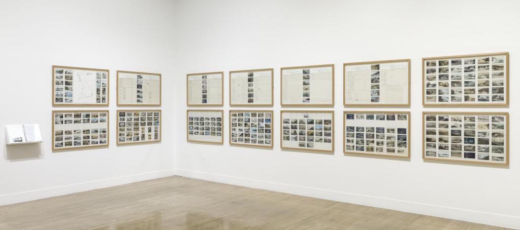
Susan Hiller: Dedicated to the Unknown Artists 1972-76

Dedicated to the Unknown Artists 1972-6 Susan Hiller born 1940 Purchased with assistance from the Art Fund 2012 http://www.tate.org.uk/art/work/T13531

Dedicated to the Unknown Artists 1972–6 consists of fourteen panels containing over three hundred original postcards depicting waves crashing onto shores around Britain. A large map annotated with each of the locations featured in the postcards is included in the first panel. The remaining panels have been subjected to what the artist has described as her ‘methodical-methodological approach’ (quoted in ‘Second Sight’ 2007, accessed 14 June 2018) and are organised into grids of postcards and tabulated details such as location, caption, legend, in vertical or horizontal format. Accompanying these panels are two additional components: a copy of a postcard-sized artist’s book and a dossier with supporting material, in which the artist describes herself as a curator presenting an exhibition of these overlooked cultural artefacts.

In 1977 Hiller discussed the work in the following way:

Dedicated to the Unknown Artists was designed as an exhibition piece with myself in the role of curator, collaborating with/extending the work of the unknown artists who created the Rough Sea ‘set’ of postcards. The ‘coincidental’ pairings of alternative descriptive languages – verbal and visual – are sustained as levels of presentation throughout the piece. While the charts may look like models of objectivity and the visual images like expressions of subjective internalizations, they lead to a series of paradoxes involving the unexpressed but intended vs. the expressed but unintended.
(Quoted in Tate Britain 2011, p.76.)

The work illustrates Hiller’s interest in the subject of memory and memorials. The title identifies the work as a tribute to the overlooked and forgotten artists who painted, photographed or hand-tinted the numerous seaside images in the postcards she collected. By making such commonplace objects the subject of a dedicated and extensive presentation, Hiller gives new status to the mundane and provides the viewer with a familiar access point from which to engage with the work. Dedicated to the Unknown Artists has also been described as a work about invisibility (see ‘Second Sight’ 2007, accessed 14 June 2018). The group of postcards only came to exist as a ‘set’ by the artist’s act of collecting them, and the visual correspondences that the collection highlights would have been previously unseen.

Hiller’s choice of sublime or picturesque seaside motifs – with their subtext of romantic desire, the soul in turmoil, and a longing for nature – contrasts with a strict conceptual methodology. Coloured images in particular were generally excluded from contemporaneous conceptual artworks, and yet for this work Hiller opted to make the genre of popular colour postcards of the British seaside her prime focus. However, the grid formation, the serial presentation and the typed labelling all recall the language of conceptualism. Writer Brian Dillon has noted: ‘That Hiller effected a study of the invisible precisely by exhibiting objects of such ravishing (and also kitsch) visual texture is surely exactly what made the work, at the time, such a scandal for adherents of an austerely linguistic Conceptualism.’ (Brian Dillon in Tate Britain 2011, p.52.)”

Further reading 
Susan Hiller, exhibition catalogue, Tate Liverpool 1996, reproduced pp.12–13.
Susan Hiller, exhibition catalogue, Tate Britain, London 2011, reproduced pp.52–5.
‘Second Sight’, Frieze, no.109, September 2007, https://frieze.com/article/second-sight-1, accessed 14 June 2018.

Helen Delaney
May 2011

Image and text reproduced from https://www.tate.org.uk/art/artworks/hiller-dedicated-to-the-unknown-artists-t13531 accessed 02/01/24

Godland

Harshness is transformed into beauty and then terror by this extraordinary film from Icelandic director Hlynur Pálmason about a 19th-century Danish pastor sent to establish a new church on Iceland’s remote south-eastern coast. I left the cinema dazed and elated by its artistry; it is breathtaking in its epic scale, magnificent in its comprehension of landscape, piercingly uncomfortable in its human intimacy and severity. There is such superb compositional sense in the still life tableau shots and the almost archaeological sense of time, creating something deeply mysterious and unbearably sad. There are echoes of Werner Herzog’s Aguirre, the Wrath of God, Roland Joffé’s The Mission, Lisandro Alonso’s Jauja – and even Howard Hawks’s Red River.

Pálmason announces in the opening credits that the story was inspired by the supposed discovery in Iceland of seven glass-plate photographs of people and places taken there at the end of the 19th century. While the claim is a deadpan fiction, his screen has an almost square 1.33:1 aspect ratio, perhaps in honour of the still photograph motif. This smaller-size, in such contradistinction to the movie’s CinemaScope ambition and spectacle, gives a density to the viewing experience.

Elliott Crosset Hove plays Lucas, a highly-strung young clergyman instructed by his bishop to travel to a pioneer community in Iceland (then a Danish dependency), superintend the church-building and install himself as parish priest. Lucas makes this arduous journey first by sea and then overland with horses, taking among his luggage a huge and burdensome cross, climbing mountains and fording rivers with it. But Lucas has a secular-ethnographic project to go with the imperial Christian mission: he dreams of taking the first pictures there, capturing the people with new technology. His cumbersome tripod goes on his back, its three spiked feet poking up behind his head, a version of the points of a crucifix. The camera is Lucas’s ordeal as he visits his stations of the cross.

Driven to the edge of madness by hardship and physical pain, Lucas has a thwarted friendship – or something more – with his translator (Hilmar Gudjónsson), and finally finds an erotic connection with Anna (Vic Carmen Sonne), the daughter of the local parishioner, who takes him in. But his life is dominated by his cantankerous, contemptuous Icelandic guide Ragnar, a tough, weatherbeaten veteran tremendously played by Ingvar Sigurdsson, the cop from Pálmason’s previous film A White, White Day. Palmasón shows that Lucas is humanised and possibly even redeemed by his encounters at journey’s end, particularly his relationship with his quasi-host, the level-headed widower Carl (a shrewdly judged performance from Jacob Lohmann), who is bemused by Lucas’s self-harming decision to come to Iceland in the most difficult way possible, and then suspicious of his potential designs on his eldest daughter. Anna’s younger sister Ida (Ída Mekkín Hlynsdóttir) has an attractively emollient role and her relationship with Lucas is gentle and sweet and brings out the nearest Lucas has to warmth.

The film’s mightiest figure is the implacable Ragnar. Far from helping Lucas across the terrain, Ragnar embodies it; he is the very personification of its hostility. As an Icelander, he hates the high-handed Dane with his book-learning. Lucas comes in turn to hate and fear him. And yet Pálmason shows that Ragnar softens imperceptibly even as he sabotages Lucas; he needs someone to confess his terror of God to while exorcising a lifetime of buried rage. In Godland, these emotions are projected out on to the stunning, daunting landscape to the accompaniment of spine-meltingly beautiful choral music. That austere, boxy screen looks like a window on to a vast, unfathomable world.

https://www.theguardian.com/film/2023/apr/05/godland-review-hlynur-palmason (accessed 08/12/23)

Carte De Tendre

‘The Carte de Tendre or the ‘Map of Tender Love’ appeared in the 17th Century novel Clélie by
Madeleine de Scudéry. It is an allegorical love map, ‘a set of instructions in love. The lover who
reads such a map is, at it were, travelling on the body of his or her love.’[1] ‘The country is
bisected by the Inclination a river that runs south to north, joined by two smaller rivers, Respect
and Gratitude before plunging into La mer dangereuse, the Dangerous Sea (unbridled emotions)
which is separated from a reef-ridden narrows, the Terres inconnues, Unknown Land.’[2] The
eroticised body is fleshed out so to speak in the form of a landscape, a libidinal topography of
het-erogenous zones. In The Book of Disquiet Pessoa mentions the Tender Map in relation to a
‘geography of our consciousness’ suggesting reality is a complex equivalent to ‘complicated
coastlines, lakes and rugged mountains.’ [3]

1] Gandelman, Claude, Reading Pictures Viewing Texts, Indiana University Press: Bloomington and Indianapolis, USA 1991 p.81/89

2] Image reproduced and text from https://bigthink.com/strange-maps/245-loves-topography-la-carte-de-tendre/ (accessed 25/07/12)

3] Pessoa Fernando, The Book of Disquiet, Ed. Lancastre Maria José de, Trans. Costa Margaret Jull, Serpent’s Tail: London 1991, p.147

Robert Smithson – Strata

Robert Smithson – Strata 1970

“Robert Smithson’s photo-essay “Strata” was published in 1970, the same year Anderson’s recycling symbol was released. 1970 also witnessed the inaugural Earth Day, which consecrated an ecological movement that had been building over the decade. Smithson’s own Earth Art during the 60s and into the 70s was similarly concerned with pollution, land reclamation and ecology, though his interests led him always to contemplate the Earth’s matter on an extremely wide time-scale.

“A book is a paper strata,” Smithson says, stringing snippet-like descriptions of distant times together with mentions of x-rays, stereoscopes and dioramas in museum displays, emphasizing the latter’s near-obsolescence so as to project the reader into the museum’s (and the text’s) entropic future. The canny paratactic construction of “Strata,” telegraphic in style and lacking conjunctions and transitions, links past, present and future through verbal abutments and layerings that connect as much as they disjoin. The point bears repeating, as Smithson’s ecological consciousness emphasizes the mind’s distance from the matter it contemplates, a distance given dynamic form in his dialectic of site and non-site, a conjoining disjunction that both bridges the gap between museum and natural site yet defies synthesis in opening the dialectic onto entropic processes in both space and time.

Sea butterflies fall into a nameless ocean. Plaster restorations collecting dust in the Museum of Natural History. The tracks of trilobites harden into fossils. Accumulations of waste on the sea bottoms. Jelly-fish baking under the sun. Digestive systems shown in diagrams. … A tendency to amorphousness….”

Image and text reproduced from https://johnculbert.wordpress.com/tag/strata-a-photogeographic-fiction/ (accessed 11/11/23)

Boscawen-ûn Stone Circle

So I’ve just got back from a residency in Cornwall where I was actually able to visit Lands End!. One of the ancient sites we visited was Boscawen-ûn Stone Circle.

“The site dates from the late Neolithic-early Bronze Age (approx. 2500-1500 BC) and consists of an ellipse circle of 19 stones, ranging in height from 0.9m (3ft) to 1.4m (4.5ft). One of these stones on the NE side is made of almost pure white quartz. In addition, there is an off-centre leaning stone 2.4m (8ft) high. It is not known whether this stone was always leaning at this angle or whether it has slipped over the years. In the NE side of the circle there is a jumble of stones that may have been part of a burial cist. There is a gap between stones on the W side of the circle, similar to the Merry Maidens stone circle but on the opposite side.

Folklore and Legend

Boscawen-ûn; which is Cornish for ‘elder tree on the downs’, takes its name from the nearby farm. The circle was recorded as far back as the early medieval period in the Welsh Triads, as one of the three principal gorsedds (Bardic meeting places) of the island of Britain. In 1928, the revived Gorsedd of the Bards of Cornwall was inaugurated at the site.

Purpose and Meaning

Like the other stone circles in West Penwith, it seems likely that Boscawen-ûn was a place for ceremony and ritual. It is known that quartz was seen as a sacred stone to the megalithic builders (when the central Hurlers circle was excavated on Bodmin Moor a whole layer of quartz foundation stones were found), so the quartz stone in the circle may have had some significance relating to healing and perhaps the moon. The fact that the circle, like others in West Penwith, had 19 stones may also relate to the 18.64 year cycle of the moon, or the 19 year metonic cycle of the moon and sun. Also, the centre stone faces in the direction of the midsummer solstice sunrise, towards an outlying standing stone, and the rising sun at midsummer illuminates a carving of two axe-heads that lie towards the base of the stone. Axes were important to the Neolithic and Bronze-Age peoples as ritual objects, and Cornish greenstone axes were traded with other tribes in England and elsewhere, so this carv- ing on the centre stone is probably a sacred symbol. In the other direction, the sun can be viewed setting between the centre and quartz stones at Samhain (Oct 31st), a pre-Christian festival, when viewed from a spot on the opposite side of the circle.

Boscawen-ûn (prounounced Bosca-noon) Stone Circle lies to the south of the main A30 road between Penzance and Land’s End about a mile before Crows-an-Wra. OS grid reference SW 4122 2736.”

Text reproduced from https://cornishancientsites.com/ancient-sites/boscawen-un-stone-circle/ , image reproduced from https://www.isleofalbion.co.uk/sites/14/boscawen_un.php (accessed 22/11/23)